Preview image. Unlock full-res
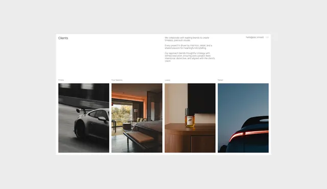
A minimal studio 'Clients' deck page that floats a single paragraph of intro copy over white, then drops a tight row of four tall portrait-format photographs, each captioned with a client name above it.
Summary
A white portfolio-deck page titled "Clients," with a left-aligned section label, a short right-column paragraph, and a contact line plus page number "03" in the top corner, resolving into a flush row of four tall portrait photos each labeled with a client name.
Visual description
The page is a white card on a light grey background. The upper two-thirds is mostly empty: a small "Clients" heading sits far left, a three-paragraph block of small grey body copy sits in the right column, and "hello@doc.limited 03" runs in the top-right corner. Below, four portrait-orientation photographs butt together edge to edge with no gutters, each topped by a tiny client caption: a motion-blurred grey sports car, a warm sunset hotel-room interior, a brown fragrance bottle on a wooden surface, and a dark car taillight against dusk-blue sky. The photos are deliberately varied in palette (cool grey, warm orange, wood brown, twilight blue) yet unified by their cinematic, low-key lighting and identical crop ratio.
Key takeaway
Carrying a logo-style client list as four cropped photographs instead of logos: it proves the work and sets the visual tone in one strip. The huge breathing room above the row plus tiny captions makes the imagery feel curated and gallery-like, and the consistent portrait crop ties wildly different subjects together.
Reuse notes
Ideal for an agency or photo-studio portfolio, deck, or about page where the work itself is the credential. Depends on genuinely strong, tonally consistent photography; weak images expose the spareness. The intentional misspellings in the captions are in the source, not added. Pair the empty upper zone with a single short statement so the white space reads as confidence rather than an unfinished slide. </content>
More like this





Keep what you find
A free account saves references to boards and can send you a weekly email of picks based on what you save.
To see every result, go Pro.