Preview image. Unlock full-res
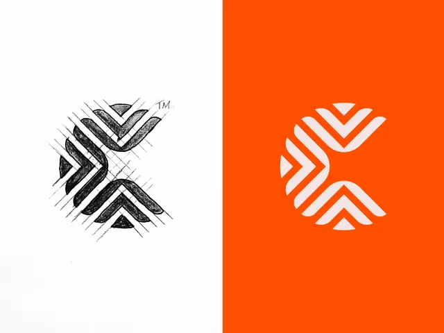
A stylized abstract logo mark is shown in sketch form on the left and as a clean white version on a bright orange field on the right.
Summary
A stylized abstract logo mark is shown in sketch form on the left and as a clean white version on a bright orange field on the right.
Visual description
The image is split vertically into two halves. The left half shows a rough hand-drawn logo sketch in black pencil on white paper with construction lines, while the right half shows the same mark simplified into a clean white vector on a solid bright orange background.
Key takeaway
The strongest move is the contrast between process and finished mark: rough sketch on one side, polished vector on the other. The logo itself uses interlocking chevron-like strokes to create a compact, symmetrical emblem with strong negative space.
Reuse notes
Use this approach when you want to show identity development from concept to final mark. It works well for branding presentations, logo case studies, and portfolio covers where a simple symbol needs to feel engineered and refined.