Preview image. Unlock full-res
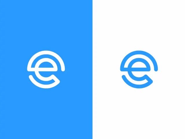
A split-screen logo presentation shows a stylized lowercase \"e\" mark centered on blue and white backgrounds.
Summary
A split-screen logo presentation shows a stylized lowercase "e" mark centered on blue and white backgrounds.
Visual description
The image is divided vertically into two equal halves, with a solid blue panel on the left and a very light white-gray panel on the right. Each side contains the same centered lowercase "e" logo drawn with rounded strokes, rendered in white on the blue side and blue on the light side.
Key takeaway
Use a single simple mark with thick rounded strokes and show it in positive and reversed colorways side by side. The split-background presentation makes the logo feel systematic and easy to evaluate.
Reuse notes
Reach for this when presenting a new brand mark across light and dark or inverse backgrounds. It works well for identity studies where clarity and legibility matter more than decoration.