Preview image. Unlock full-res
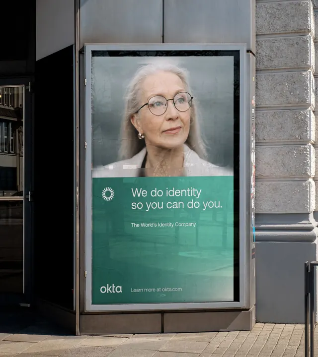
Okta's street-facing ad campaign pairing a portrait of an older woman with the tagline 'We do identity so you can do you,' demonstrating the brand's identity-management product message through inclusive human imagery.
Summary
Okta's street advertising depicts a real, older woman with white hair and glasses, anchoring the brand's message that identity management is about enabling people, not restricting them.
Visual description
A large rectangular billboard mounted on a street-facing urban fixture shows a portrait photograph of an older woman in the upper half, taken with soft, natural lighting against a neutral grey background. Below the portrait, a teal/green band spans the width of the panel, containing white sans-serif type: the headline "We do identity so you can do you." in medium weight, with smaller secondary text "The World's Identity Company" below it. At the bottom left of the teal section, the "okta" wordmark appears in lowercase white type, paired with a small sun-like icon. The composition balances restraint (minimal color, clean framing, ample whitespace) with human warmth (the portrait is direct and approachable). The surrounding environment shows a grey concrete wall and dark windows, making the campaign stand out through color and typography alone.
Key takeaway
The direct portrait-plus-tagline combination creates an unexpectedly empathetic pitch for a B2B security product; the message works because the visual is real, not stock. The teal accent band is restrained but distinct, and the wordmark placement is confident without overshadowing the human moment. The typography hierarchy moves from portrait (attention) to headline to brand, not the reverse.
Reuse notes
Strong for any identity, security, or trust-dependent B2B brand that wants to convey "we protect people, not just systems." The portrait treatment would fail with a cheesy smile or overly lit setup; authenticity in the photo is essential. Works best in urban or high-visibility contexts where the human scale reads powerfully. The teal color is specific to Okta and shouldn't be copied; the principle is picking one restrained, non-corporate accent to break the grey/white palette.
More like this







Keep what you find
A free account saves references to boards and can send you a weekly email of picks based on what you save.
To see every result, go Pro.