Preview image. Unlock full-res
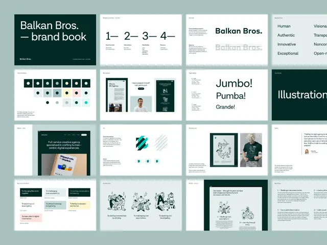
A creative-agency brand book laid out as a 16-page thumbnail grid, pairing a deep-green cover system with logo, color-chip, typography and illustration pages.
Summary
An overview spread of the Balkan Bros agency brand book, shown as a grid of roughly sixteen page thumbnails. The defining move is the deep-green and white split title system that opens the deck and recurs as full-bleed dividers.
Visual description
The page reads as a 4-column thumbnail wall of brand-book pages on a white field. Top-left a dark green cover holds "Balkan Bros. brand book" in white; beside it a numbered 1-2-3-4 contents row, a text-heavy intro page, and a black-on-white logo page. The second row covers a color system (rounded chips and a swatch row), a team/quote card, an oversized type page reading "Jumbo! Pumba! Grande!", and a green "Illustration" divider. Lower rows show service cards in pale green, teal accent shapes set on diagonals, line-drawn illustration plates, and a tinted pull-quote panel. The palette is restrained: deep forest green, muted teal-grey, off-white, with green-tinted pastel content blocks. Type is a clean sans throughout with display-scale headlines.
Key takeaway
The two-tone title system: a single saturated brand green flipped between white-on-green covers and green-on-white interior pages gives the whole deck rhythm without a second accent color. Also the muted pastel content cards (pale green, soft teal) that keep a corporate deck from feeling sterile.
Reuse notes
A strong template when presenting a full identity or brand book as a single contact sheet, for an agency pitch or portfolio case study. The mono-green palette pairs well with one warm illustration accent. Reach for it when you want corporate polish that still feels human.
More like this








Keep what you find
A free account saves references to boards and can send you a weekly email of picks based on what you save.
To see every result, go Pro.