Preview image. Unlock full-res
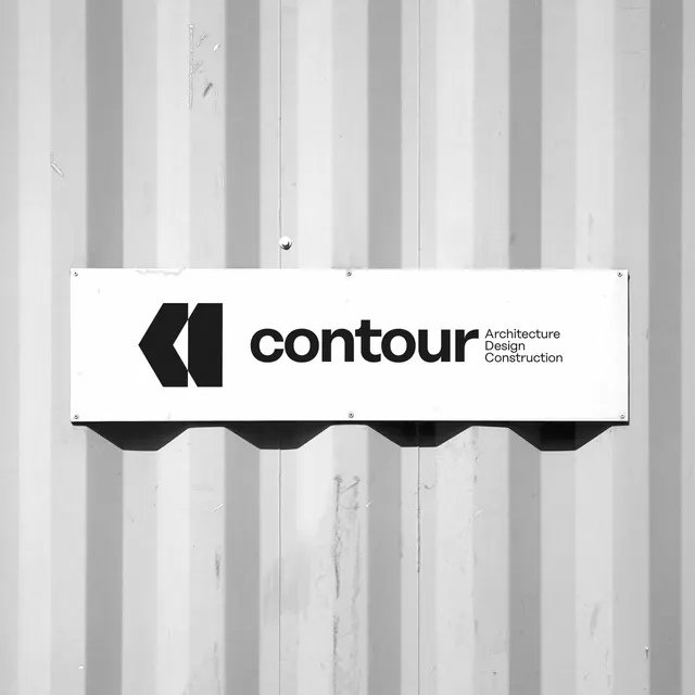
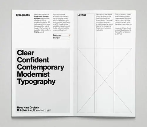
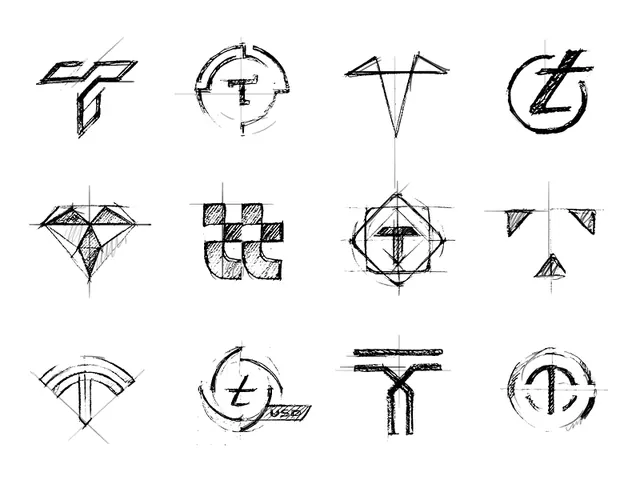
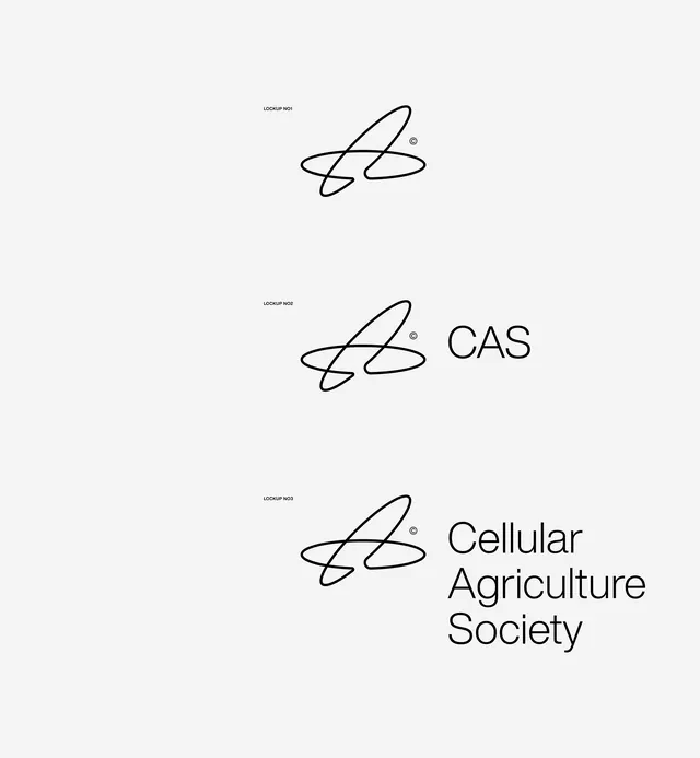
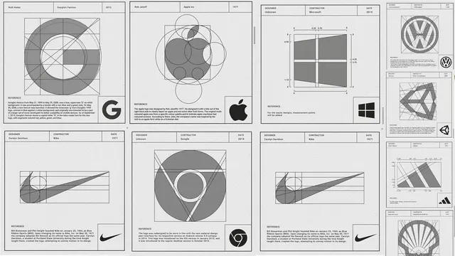
A monochrome collage of logo anatomy studies and construction diagrams arranged as multiple framed panels.
Summary
A monochrome collage of logo anatomy studies and construction diagrams arranged as multiple framed panels.
Visual description
The image shows several bordered panels containing logo construction drawings, circular guides, measurement lines, and small reference blocks. Most panels are grayscale with thin rules, dense annotations, and brand mark examples placed in corners or lower sections.
Key takeaway
Use a strict grid with thin rules and construction geometry to make identity work feel analytical and authoritative. Pair large diagram areas with compact reference text so the page reads like a design spec.
Reuse notes
Reach for this when presenting logo research, mark construction, or identity guidelines that need a technical feel. It works best for monochrome systems where clarity and precision matter more than decoration.