Preview image. Unlock full-res
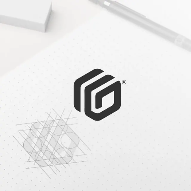
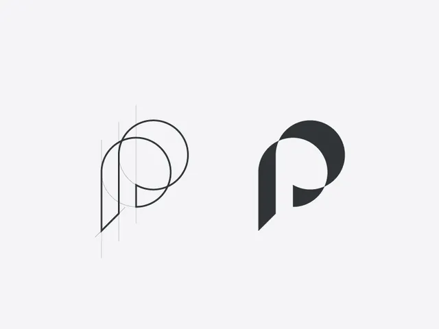
A minimalist monogram logo built from overlapping circular and linear forms to create a stylized letter P.
Summary
A minimalist monogram logo built from overlapping circular and linear forms to create a stylized letter P.
Visual description
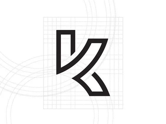
The image shows two versions of a stylized letter P on a pale off-white background. On the left is a construction diagram with thin guide lines and overlapping circles, and on the right is the finished solid dark-gray monogram.
Key takeaway
Use overlapping geometry and hidden construction logic to build a monogram that feels precise and intentional. The negative space inside the letter does most of the visual work.
Reuse notes
Reach for this when designing identity marks that need to feel engineered, minimal, and scalable. It works best for brands wanting a clean monochrome logo with a technical or editorial edge.