Preview image. Unlock full-res
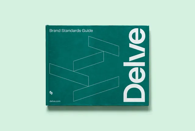
Brand standards guide cover using deep teal, white geometric line art, and bold sans-serif wordmark against pale mint backdrop.
Summary
A brand standards guide cover featuring deep teal and white geometric line work layered isometrically, with the wordmark "Delve" integrated into the right edge in bold sans-serif.
Visual description
Pale mint-green background framing a rectangular composition with a dark teal interior panel. Stacked isometric rectangular forms rendered in subtle white line art create depth and rhythm across the teal field. The wordmark "Delve" sits vertically on the right side in large, bold, white sans-serif capitals, serving as both typography and structure. A small icon mark and "delve.com" appear in the lower left corner, maintaining consistent branding hierarchy.
Key takeaway
The integration of geometric line work as a dynamic background element without overwhelming the wordmark. The sophisticated use of negative space and isometric depth to suggest modernity while remaining corporate-appropriate. The vertical wordmark orientation as a distinctive compositional anchor.
Reuse notes
Effective for SaaS, fintech, or technology brands seeking a premium yet approachable identity. Works well at small scale on business cards or letterhead. The color pairing (teal on mint) reads clean on white but pairs best with reserved, professional applications.
More like this





Keep what you find
A free account saves references to boards and can send you a weekly email of picks based on what you save.
To see every result, go Pro.