Preview image. Unlock full-res
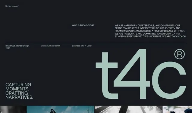
Branding and identity design for The 4 Color by Anthony Smith, showcasing a minimalist dark-background presentation with large geometric logo mark and custom sans-serif wordmark.
Summary
Branding and identity design for The 4 Color by Anthony Smith, showcasing a minimalist dark-background presentation with large geometric logo mark and custom sans-serif wordmark.
Visual description
Dark charcoal background with minimal white and muted teal accents. Top section contains a mission statement in uppercase sans-serif: "CAPTURING MOMENTS, CRAFTING NARRATIVES" with supplementary brand descriptor text below. The centerpiece is an oversized geometric wordmark spelling "t4c" in pale mint-green sans-serif, with a bracketed registered trademark symbol. Large-scale letterforms occupy two-thirds of the composition. A horizontal rule divides the layout. Footer shows project credits in small type: year (2023), client name, and business category. Three photographic samples in muted tones anchor the bottom edge, implying portfolio work.
Key takeaway
The oversized, confident wordmark treatment that reads as both logo and headline. Sparse use of one accent color (pale teal) against dark and white to create visual interest without complexity. The stark separation of narrative copy at top, dramatic mark in center, and supporting imagery at bottom as a replicable layout pattern for designer/agency portfolios.
Reuse notes
Excellent template for creative-service branding needing to convey trustworthiness and craft expertise. The monochromatic foundation with single teal accent scales well across media. Works best when the business can support the minimalism with strong photography and clear positioning copy. The dark background pairs well with portfolio work and case studies.
More like this








Keep what you find
A free account saves references to boards and can send you a weekly email of picks based on what you save.
To see every result, go Pro.