Preview image. Unlock full-res
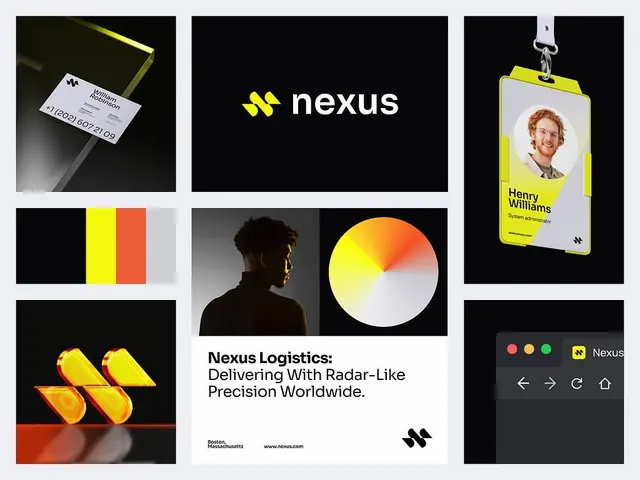
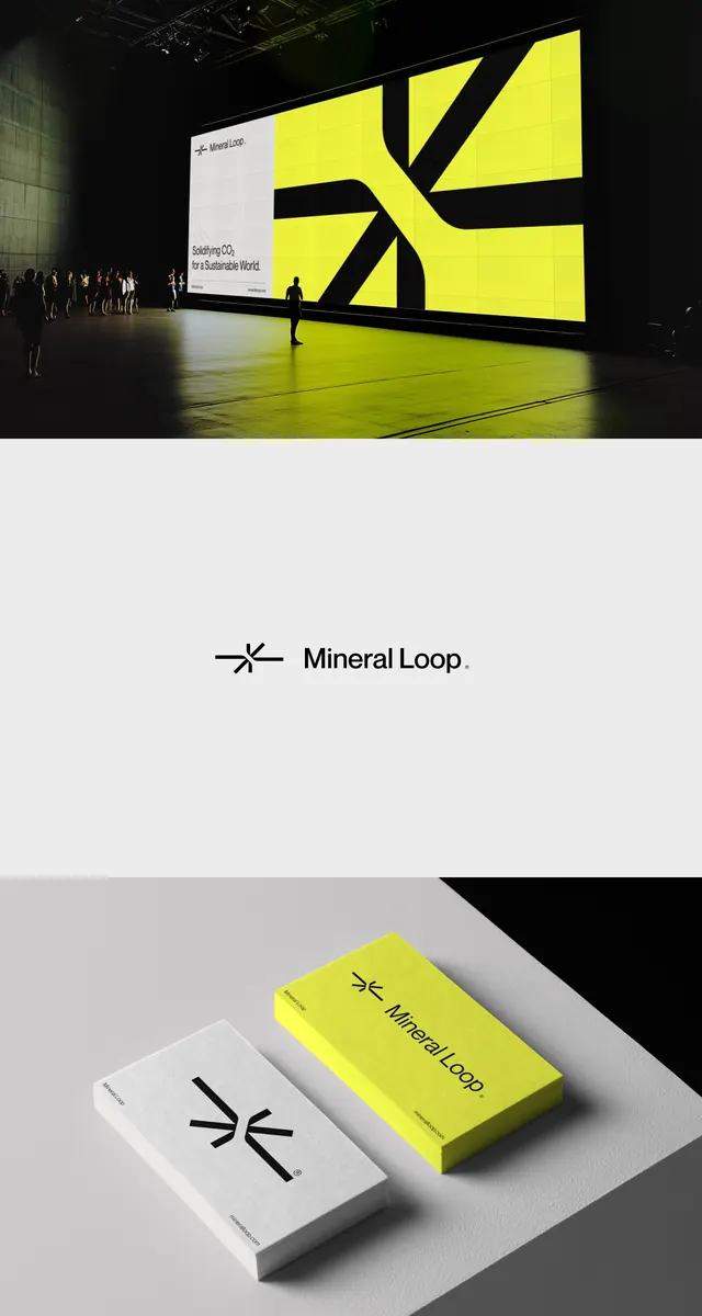
High-contrast brand identity for Mineral Loop featuring a four-part interlocking mark in neon yellow and black, shown at scale, as logotype, and on business cards.
Summary
A modular geometric mark composed of four interlocking curved segments in bright yellow and black, with logotype and stationery applications shown in presentation mockups.
Visual description
Three-panel layout. Top: a large-scale installation mock showing a glowing neon yellow geometric mark (four curved segments arranged in a rotational pattern) on a white wall with black cutout panels behind it, creating depth. Middle: the "Mineral Loop" logotype in fine sans-serif (spaced, lowercase). Bottom: the mark applied to a stack of white and yellow business cards, shown at an angle on a concrete surface with geometric black forms, demonstrating tactile branding. The color palette is strictly neon yellow (#EDF23E), black (#0E0E0D), white, and light grays. The geometry is precise and mathematical, with curves appearing to lock and rotate infinitely.
Key takeaway
The modular, interlocking mark system: four identical curved segments that can rotate and lock to create a single unified icon. This enables scale flexibility (giant installation, tiny card detail) and memorability. The neon-against-black contrast is bold enough to read at distance and conveys tech-forward precision. The stationery application shows restraint: minimal color, generous whitespace, the mark as hero.
Reuse notes
Ideal for tech, fintech, or design-forward B2B brands where a strong geometric identity needs to work at multiple scales and color-constrained contexts. The interlocking segments suggest systems, modularity, or connectivity. Neon yellow reads as high-energy and contemporary; reserve it for brands that can afford bold. Works equally well reversed (yellow on black) for signage.