Preview image. Unlock full-res
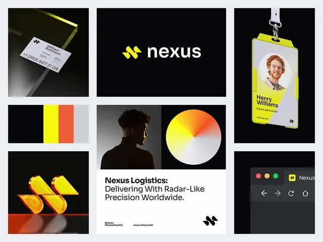
Logistics company identity using bold yellow-to-orange gradient geometric chevrons as the signature mark, applied across stationery, ID badges, apparel, and product interfaces on high-contrast dark and light compositions.
Summary
A logistics technology brand using a bold double-chevron mark in yellow-to-orange gradient, shown across stationery, personnel identification, apparel, interfaces, and a tagline emphasizing precision delivery.
Visual description
Nine-item composition on light gray background. Top left: embossed business card on black and olive acetate with minimal white text and the double-chevron mark. Top center: primary wordmark "nexus" in white sans-serif on pure black background, with the double-chevron icon below. Top right: personnel ID badge with yellow neon accent frame, portrait photo, "Henry Williams" name, "System Administrator" title, and the mark. Middle left: horizontal color palette showing black, bright yellow, vibrant orange-red, and light cream blocks. Middle center: portrait of a person in silhouette against gray, accent-lit in yellow from the side, with a yellow-to-orange-to-white circular gradient wheel below it (color system visualization). Middle right: 3D perspective view of the double-chevron mark in bold yellow and orange gradients, tilted to show depth and motion. Bottom left: stylized icon variations of the chevron form in yellow and orange, rendered with angular precision. Bottom center: headline text reading "Nexus Logistics: Delivering With Radar-Like Precision Worldwide" in black sans-serif on white, with location branding (Boston, Massachusetts) and website below. Bottom right: dark dashboard/UI mockup showing the mark as accent, rounded icon buttons in red/orange/green, navigation arrows, and home symbol in a compact interface layout.
Key takeaway
The double-chevron as a modular icon: it's simple enough to scale to favicon size but bold enough to anchor a full poster. The yellow-to-orange gradient fills a neon warmth against the dark backgrounds without feeling cheap or dated—the precision geometry keeps it sophisticated. The tagline "Radar-Like Precision" perfectly encodes the brand promise (tracking, accuracy, technology) into language that supports the radar-dial color wheel and the forward-pointing chevron form.
Reuse notes
Ideal for logistics, delivery, or technology B2B brands that need to signal reliability and speed. The high-contrast palette reads well at any size and in motion (dashboard, vehicle wrap, app icon). The gradient chevron is ownable and extensible—it can become a loading spinner, progress bar, or directional element. The modular approach (cards, badges, UI elements) works well for enterprise software. Avoid for brands requiring warmth or approachability; the precision and high-contrast aesthetic feels corporate and technical.