Preview image. Unlock full-res
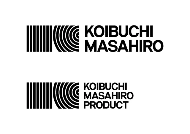
Identity system pairing a geometric striped-and-curved pattern mark with clean sans-serif type, repeated across stationery.
Summary
Modular branding system combining a geometric linear pattern mark (vertical and curved lines in alternating rhythm) with a bold sans-serif wordmark, shown on primary and secondary applications.
Visual description
Two examples of a nameplate composition. The mark consists of parallel vertical stripes transitioning into concentric curves, resembling a record or topographic pattern. It sits left of the name "KOIBUCHI MASAHIRO" set in condensed, all-caps sans-serif type. The second example expands to "KOIBUCHI MASAHIRO PRODUCT" below. The entire system is rendered in solid black on white, maintaining high contrast and optical clarity. The mark and type are tightly aligned, forming a cohesive logotype unit.
Key takeaway
The modular pattern mark is infinitely scalable and can work as a standalone icon, background pattern, or detail element while maintaining brand recognition through its distinctive geometry. Pairing the mark with tight, geometric type creates mechanical, trustworthy authority. The repeating-line language suggests precision, data, and forward thinking without literal representation.
Reuse notes
Ideal for technology, manufacturing, or data-focused brands. The high contrast black-and-white execution ensures legibility at all sizes and strong reproduction across media. The pattern's symmetry and rhythm make it suitable for pattern-filling applications (backgrounds, textures) or icon systems. Best deployed at larger scales to allow the pattern detail to remain visible.
More like this







Keep what you find
A free account saves references to boards and can send you a weekly email of picks based on what you save.
To see every result, go Pro.