Preview image. Unlock full-res
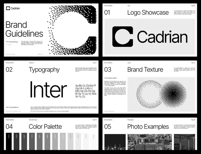
Six-page brand guidelines for Cadrian, a technology company, showcasing a systematic identity built on sans-serif typography, geometric constraints, and a distinctive pixelated textural mark.
Summary
A comprehensive brand guidelines document for Cadrian showcasing a minimal, technology-focused identity built on modular grid structure, sans-serif typography, nested-circle geometry, and a distinctive pixelated texture asset.
Visual description
Six pages of a brand guidelines document arranged in a 2x3 grid with consistent black borders and modular spacing. Page 01 (top left) shows the Cadrian logo: a bold rounded-square letterform with nested circle cutouts, paired with the logotype in a geometric sans-serif. A pixelated diagonal form in the upper right acts as a secondary texture mark. Page 02 displays the chosen typeface (Inter or similar) in both headlines and body weights with a typography rationale statement. Page 03 features a distinctive texture system: two perpendicular pixelated oval forms (one sharp-to-soft transition, the other dual-tone) set over explanatory body copy. Page 04 shows the color palette: a full range from solid black through grays and neutrals to white, each swatch labeled with a specific hex code. Page 05 displays three urban photography examples (black-and-white building and street scenes) demonstrating how the photographic brand language works. Each page is numbered and includes a page number (06, 17, 23, 34, 36) and consistent body copy about the respective brand system element.
Key takeaway
The use of a singular geometric texture (the pixelated oval) as a non-literal brand asset that unifies across applications without competing with typography. The color palette page showing all values with hex labels makes implementation foolproof. The photography page signals a photographic style rather than relying on illustration, anchoring the identity in real contexts.
Reuse notes
Use this as a reference for technology or developer-tool brands that need to balance minimalism with systematic rigor. The grid-based layout and numbered sections work well for technical documentation. The monochromatic palette with strategic grayscale range is especially useful when color budgets are constrained or the brand must work in black-and-white reproduction. The texture system (pixelated forms) is reusable for data-adjacent brands needing visual complexity within a minimal framework.
More like this




Keep what you find
A free account saves references to boards and can send you a weekly email of picks based on what you save.
To see every result, go Pro.