Preview image. Unlock full-res
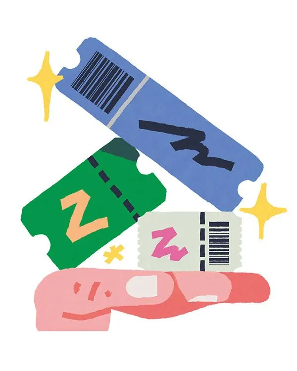
Flat-designed product labels and inventory tags colored in blue, green, pink and white, decorated with barcodes, the letter 'Z', and four-point stars scattered across a white ground.
Summary
Asymmetrically arranged product labels in blue, green, and pink, each featuring barcodes, typography, or abstract forms, plus bright four-point stars that frame the composition.
Visual description
A collection of approximately six stylized product tags and labels illustrated in flat vector style, scattered across a clean white background. Upper left is a medium-blue label with a barcode pattern and internal dark line, tilted slightly. A golden-yellow four-point star sits nearby. Center-left is a bright green label with a white dashed border and a gold "Z" in the interior. Another label below is cream-colored with a bright pink "Z" and barcode segment. The bottom is a large soft-pink tag with white and pink circular cutout shapes and small maroon dashes. The composition is playful and dynamic, with no grid alignment, suggesting inventory, labeling, or packaging exploration. Colors are clear and bright but not neon. Star accents are distributed asymmetrically, one in each corner. The overall feeling is naive, hand-drawn, and appropriate for brands targeting casual or young consumers.
Key takeaway
The use of simple repeated elements (barcodes, letter forms, stars) at varying scales to create visual rhythm without pattern. The pastel-to-vibrant color mix (soft pink, clear blue, fresh green) is child-friendly yet sophisticated. The scattered asymmetric arrangement is more engaging than a grid and suggests both organization and play. The flat, matte finish is approachable and works across digital and print contexts.
Reuse notes
Ideal for consumer packaging, e-commerce product pages, youth-oriented branding, or retail collateral. The playful tone and clear geometric shapes work well at thumbnail size and on mobile screens. Works especially well for wellness, food, or toy brands. Can feel dated if applied to serious, professional, or luxury categories. Barcode and star motifs may feel too literal for some audiences; modify or remove if conveying sophistication is paramount.
More like this

Keep what you find
A free account saves references to boards and can send you a weekly email of picks based on what you save.
To see every result, go Pro.