Preview image. Unlock full-res
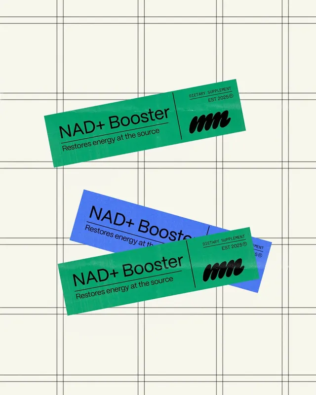
Tilted green and blue supplement sachet labels for a 'NAD+ Booster' scattered over a hand-drawn grid, pairing a wobbly blob mark with crisp sans-serif type.
Summary
A small supplement-brand identity shown as several long sachet labels for "NAD+ Booster," tilted at loose angles and overlapping on an off-white hand-ruled grid.
Visual description
Three or four narrow horizontal labels float over a cream background scored with thin, slightly hand-drawn black grid lines. Each label comes in either bright kelly green or cobalt blue, with all type set in black. The left half carries the product name "NAD+ Booster" in a medium-weight sans, a thin rule, then the tagline "Restores energy at the source." A thin vertical line divides off the right end, which holds tiny tracked caps reading "DIETARY SUPPLEMENT / EST 2025" beside a chunky black squiggle blob that acts as the brand mark. The labels are casually rotated and stacked so green and blue versions overlap, presenting the system as a flexible color set rather than one fixed lockup.
Key takeaway
The slanted, overlapping label arrangement on a visible grid is a cheap, photo-free way to show packaging as a living system. The wobbly squiggle blob beside otherwise rigid Swiss type adds personality without breaking the clean grid. Splitting the label with a hairline vertical rule (name on one side, legal microcopy on the other) is a tidy info-hierarchy move.
Reuse notes
Good reference for DTC wellness, supplements, energy, or functional-food packaging and for brand-identity case-study mockups. The cream grid backdrop reads as "studio presentation," so reach for it in pitch decks or portfolio shots. Swap the blob for any expressive mark; the layout carries the system on its own.