Preview image. Unlock full-res
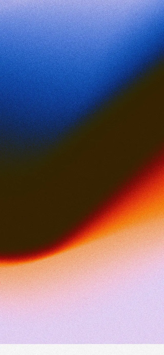
An abstract color-field study with a diagonal gradient sweep from cool indigo at upper left to warm orange-pink at lower right.
Summary
An abstract color-field study with a diagonal gradient sweep from cool indigo at upper left to warm orange-pink at lower right.
Visual description
A smooth, undirected gradient field fills the entire frame. The upper left quadrant is deep saturated indigo-blue; a sharp diagonal edge crosses the center, below which the palette shifts through dark olive/brown into warm orange, red, and finally soft pink at the lower right. The gradient is soft and blended, with no hard boundaries. There is no text, imagery, or compositional structure beyond the directional color flow itself.
Key takeaway
The color harmony: indigo-to-orange is a near-complementary split that reads as both calm and energetic without clashing. The gradient's smoothness and the diagonal direction imply motion and depth with just color alone. Perfect for brand backgrounds, splash screens, or illustration studies.
Reuse notes
Works as a brand accent background, digital wallpaper, or exploration piece for color palette development. The diagonal sweep suggests direction without literal form. Pairs well with clean typography or minimal iconography placed on top.
More like this


Keep what you find
A free account saves references to boards and can send you a weekly email of picks based on what you save.
To see every result, go Pro.