Preview image. Unlock full-res
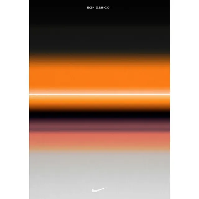
Vertical color strip labeled BQ 4629-001, transitioning from black through vibrant orange-yellow to warm brown and pale beige, with a subtle Nike Swoosh at the base.
Summary
Nike's vertical color palette system transitioning from black through burnt orange and warm brown to pale beige, anchored by a material label and brand mark.
Visual description
A tall vertical strip labeled "BQ 4629-001" at the top in small sans-serif. From top to bottom: deep black fades into a saturated burnt orange band with a thin white dividing line, then transitions through warm reddish-brown tones, and finally reaches a light neutral beige. The Nike Swoosh appears faint at the bottom of the composition, suggesting a material or product reference. The gradient is smooth and blended, creating a sense of depth and material progression.
Key takeaway
The discipline of color systems expressed as vertical material strips. The warm color journey from dark to light works as a visual language that could extend across brand applications, packaging, or digital interfaces. The thin white divider acts as a visual hierarchy punctuation mark.
Reuse notes
Excellent as a reference for developing warm, sophisticated brand palettes or product material specifications. Works well for luxury, athletic, or lifestyle brands needing a cohesive color system. The gradient technique is ideal for applications requiring smooth material transitions.
More like this






Keep what you find
A free account saves references to boards and can send you a weekly email of picks based on what you save.
To see every result, go Pro.