Preview image. Unlock full-res
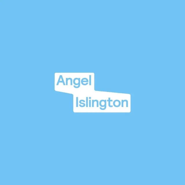
Two-line wordmark with sans-serif type inside overlapping white rounded-rectangle containers, set on a bright sky-blue background.
Summary
Two-line wordmark with sans-serif type contained within overlapping white rounded-rectangle boxes, arranged vertically on a bright sky-blue ground.
Visual description
Solid sky-blue background with two white rounded-corner rectangular containers stacked with a slight overlap. The first container holds "Angel" in large blue sans-serif type; the second holds "Islington" in the same typeface. The containers have generous padding and soft corner radius, creating a clean, contemporary feel. The overlapping offset gives the composition gentle movement while maintaining strict geometric discipline. Ample negative space surrounds the wordmark, emphasizing its clarity and modern character.
Key takeaway
The use of geometric containers to frame type: the rounded boxes become part of the logo identity, not just type. The vertical stacking with deliberate overlap creates forward motion and visual hierarchy without size variation. The color choice (bright blue background with white containers) is bold and highly legible.
Reuse notes
Effective for place-names, location-based brands, or institutions where clear, authoritative identification is needed. The two-line structure works well for longer names. Scales well across signage, digital, and small applications. The bright blue reads as friendly and contemporary rather than corporate, making it versatile across sectors.