Preview image. Unlock full-res
A cohesive nonprofit identity system for an education ministry using deep green, mint, and light blue with illustrated personnel and role-based badge colors.
Summary
A cohesive nonprofit identity system for an education ministry using deep green, mint, and light blue with illustrated personnel and role-based badge colors.
Visual description
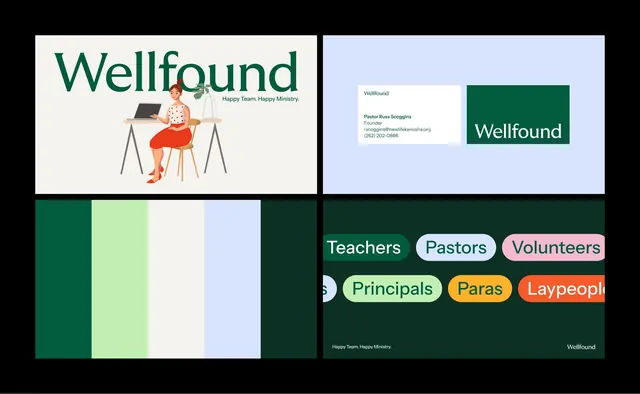
Multi-component brand system for "Wellfound." Primary mark is hand-lettered serif wordmark in deep forest green. Composition shows a founder portrait illustration (woman at desk with plant, warm tones), full color palette (deep green, mint, off-white, pale blue, forest shadows), and a system of role-based rounded-pill badges in distinct colors (pastels and warm tones: Teachers in green, Pastors in pale blue, Volunteers in pink, Principals in lime, Paras in orange, Laypeople in coral). All type is clean sans-serif; the tagline is "Happy Team. Happy Ministry."
Key takeaway
The use of distinct, differentiated badge colors to denote roles while maintaining visual cohesion through a limited, harmonious palette. The humanizing illustrated figure anchoring the brand identity. The pairing of a hand-lettered organic wordmark with crisp, geometric supporting components. The deep green base that conveys both trust and warmth without coldness.
Reuse notes
Ideal for community-oriented organizations, nonprofits, educational institutions, and people-centric services. The color system is designed for quick visual parsing across many personas. The approach works well in dashboard/interface contexts where role-based UI is needed. The illustration style adds approachability and humanity; works less well in highly corporate or minimalist sectors.