Preview image. Unlock full-res
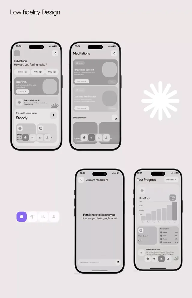
Four low-fidelity smartphone wireframes showing user interface layout and information hierarchy for a health-tracking or wellness application.
Summary
Four low-fidelity wireframe mockups of smartphone screens demonstrating user interface patterns and information architecture for a healthcare or wellness application.
Visual description
The design shows four iPhone mockups arranged in a 2x2 grid against a light mauve background with a white starburst icon in the top right. Each screen uses grayscale wireframing: placeholder blocks represent content sections, buttons, and navigation elements. The first screen (top left) displays a user greeting ("Hi! Hello...") with menu items and content cards. The second screen (top right) shows "Roadmap" as a heading with content placeholders and tabs. The third screen (bottom left) contains a longer text block and interface elements, while the fourth screen (bottom right) displays a data visualization (likely a chart or graph) with statistical information. All screens use a sans-serif typeface and maintain consistent spacing and alignment across the mockup set. A toolbar at bottom left contains interface design elements.
Key takeaway
The wireframe approach efficiently demonstrates information hierarchy and screen flow without visual distraction. The grayscale treatment focuses attention on layout and content structure. The consistent iPhone frame style creates a cohesive presentation of related screens.
Reuse notes
Use as a reference for healthcare or wellness app user flows, onboarding sequences, and dashboard layouts. The low-fidelity wireframe style works well in early design presentations to stakeholders. The muted color treatment makes it suitable for pairing with different brand color palettes during development.