Preview image. Unlock full-res
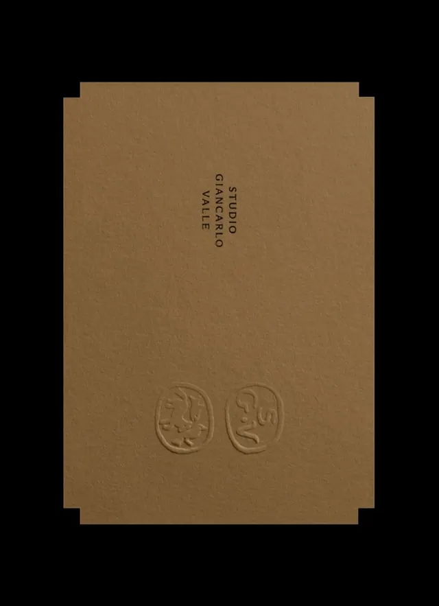
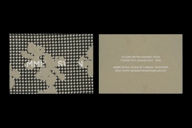
Split business card pairing a monochromatic checkerboard logo on cream with a kraft-colored text panel.
Summary
Split-layout business card with a minimalist, monochromatic checkerboard-pattern logo on cream opposite a kraft-colored text panel.
Visual description
Two rectangular cards shown side by side. Left card: cream background with a small-scale geometric checkerboard pattern (grid of squares in dark gray/black) centered, creating a subtle, textured mark. Right card: warm kraft/tan tone with minimal sans-serif body text in a lighter shade, arranged in two short lines. Both cards employ a cream-and-neutral palette with high contrast between mark and negative space. The edge treatment and proportions suggest a standard business card format.
Key takeaway
The restraint of a logo that is a pure pattern (checkerboard) rather than a representational mark, making it infinitely scalable and adaptable. The split-information layout avoids type-over-logo clash by separating them into distinct zones. The kraft-tone verso as a sophisticated alternative to white, grounding premium identity materials.
Reuse notes
A template for minimal, craft-forward brand identities in fashion, design, and creative services. Works well when the logo is intentionally abstract or geometric. Pair with condensed or serif display type for maximum impact. Avoid if color diversity is essential to the brand.