Preview image. Unlock full-res
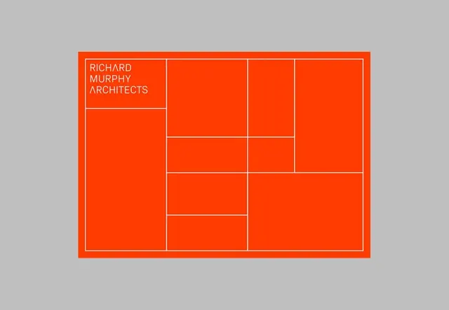
Architectural studio logo built from a nested grid of rectangles in bright orange with white lines, brand name stacked in the top-left cell.
Summary
Architectural studio identity built from a modular grid system of nested rectangles in bright orange with white dividing lines and stacked sans-serif wordmark.
Visual description
A bright orange (hex #FF3C00) rectangular badge on neutral gray background divided into a nested grid of smaller rectangles by thin white lines. The wordmark "RICHARD MURPHY ARCHITECTS" sits in white sans-serif type in the top-left compartment. The grid pattern is asymmetric but balanced: a tall left column is paired with a narrower right section subdivided horizontally into rectangles of varying heights, creating a modular, almost floor-plan quality that echoes the studio's architectural practice.
Key takeaway
The grid-based logo construction that feels both brand mark and diagram, perfectly aligned with the industry. The restraint of a two-color palette (orange and white on neutral ground) with no fills, only borders and outlines, creating a lightweight, legible mark at any scale.
Reuse notes
Strong fit for architecture, construction, real-estate, or engineering firms. The grid metaphor reads immediately as structural and systematic. Works as a primary mark or as a flexible icon system where individual cells can be highlighted. Keep the orange vibrant and the white crisp for clarity; subdues easily on dark backgrounds.