Preview image. Unlock full-res
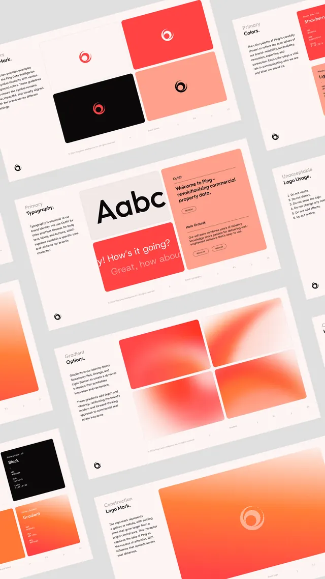
Angled isometric view of a coral and off-white brand guideline system for Ping, fanning out logo, color, type, and gradient boards as floating cards.
Summary
A brand-identity presentation for an app called Ping, shown as a stack of guideline boards tilted into a diagonal isometric grid so the whole system reads at once.
Visual description
Roughly a dozen light off-white boards are angled uniformly and arranged in offset columns, each a page from the guideline deck. Visible boards cover the logo mark (a coral ring with a notched dot, shown on white and reversed on black), a Colors board listing the coral and red-orange swatches with values, a Typography board headed Aabc, Logo Usage and Logo Mark spec pages with bullet rules and a small registration-style icon, a Gradient Options board, and chat-bubble mockups in coral that read like product UI samples. The palette is disciplined: warm coral-to-red-orange gradients and solid coral blocks against near-white, with black used sparingly for reversed panels. Type is a clean sans throughout.
Key takeaway
Presenting a full brand system as one diagonally tiled board wall, so a viewer grasps the logo, color, type, and application rules in a single glance instead of paging through a PDF. The tight coral-and-off-white restraint, with one black reversed panel for contrast, keeps a dozen boards feeling like one system.
Reuse notes
A strong format for a portfolio case-study hero or a brand-reveal slide where you want to show breadth of deliverables without legibility of every word. Render the boards at consistent angle and spacing or it turns to clutter. Best for a warm, friendly consumer or SaaS brand; the isometric treatment is decorative, so include flat detail shots elsewhere.
More like this





Keep what you find
A free account saves references to boards and can send you a weekly email of picks based on what you save.
To see every result, go Pro.