Preview image. Unlock full-res
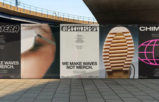
Outdoor campaign for CHIMERA beauty featuring oversized product photography on black backgrounds with bold geometric imagery and minimal white sans-serif typography.
Summary
Outdoor campaign for CHIMERA beauty featuring oversized product photography on black backgrounds with bold geometric imagery and minimal white sans-serif typography.
Visual description
Three large billboard panels shown on a covered urban structure. The leftmost shows a close-up of skin texture with eyewear detail; center panel displays the brand name CHIMERA in bold geometric sans-serif with smaller supporting text on cream; right panel features woven geometric bands in tan and brown. Each panel alternates between dark backgrounds (navy/black) with oversized product crops and cream-colored panels with tight typography. The recurring geometric line motifs and consistent black/cream/tan palette unify the campaign across surfaces.
Key takeaway
The confident scale of product photography paired with pure geometric shapes creates a confident beauty brand voice. The consistent use of oversized bold type (all-caps CHIMERA) opposite quiet small text creates hierarchy. The limited palette of black, cream, tan, and a single pop of pink maintains sophistication across three very different visual approaches.
Reuse notes
Strong reference for beauty and cosmetics brands aiming for premium, international positioning. The formula of product-forward photography plus geometric accent elements works across fashion and wellness sectors. Assumes photographic assets are high quality and can anchor the composition.
More like this





Keep what you find
A free account saves references to boards and can send you a weekly email of picks based on what you save.
To see every result, go Pro.