Preview image. Unlock full-res
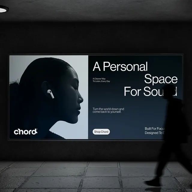
A minimalist brand environment for Chord audio products showing a profile portrait paired with a bold sans-serif tagline and earbuds product placement.
Summary
A dark-mode product environment for Chord audio with a split composition: a profile portrait in cool light gray on the left, and a bold sans-serif tagline paired with tagline copy, CTA button, and brand messaging on the right.
Visual description
A large horizontal billboard mounted on a dark wall featuring a strict left-right split. The left half is a grayscale portrait of a person in profile wearing Chord earbuds, shot against a cool light-gray background with soft sculptural lighting that emphasizes facial contours. The right half is black or very dark navy with oversized white sans-serif type reading "A Personal Space For Sound," a subheading "A Cleaner Way To Listen, Every Day," a supporting statement "Turn the world down and come back to yourself," a white rounded-pill CTA button labeled "Shop Chord," and smaller copy "Built For Focus, Designed To Last." The earbuds are visible and prominent in the portrait. Grid-aligned and architectural.
Key takeaway
The portrait-as-product-feature strategy: showing the user experience (a person listening) rather than just the earbud hardware. The split composition (imagery plus typographic narrative) is intuitive and high-impact. The tagline is emotionally resonant ("A Personal Space For Sound") while remaining professional and aspirational. The cool-gray and black palette communicates premium quality without warmth, which suits focused, introspective products. The button is visually distinct against the dark background.
Reuse notes
Strong for premium audio, wellness, and consumer tech brands targeting adults. The intimate scale of the portrait works best at large size (billboard, hero web section). The copy style (poetic, benefit-driven) pairs with this visual language. The dark palette is essential; remove it and the impact falls. The CTA button placement and style are effective conversion tools. The "personal space" messaging aligns with privacy-forward or focus-oriented product positioning. Less suitable for budget brands or loud, social-first products.