Preview image. Unlock full-res
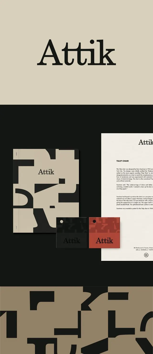
Attik design studio identity: geometric serif wordmark paired with asymmetrical modular grid patterns in warm beige and black across stationery and brand applications.
Summary
Attik design studio identity system: geometric serif wordmark unified with asymmetrical modular grid patterns in warm beige and black across stationery, business cards, and collateral.
Visual description
A comprehensive branding system shown across five applications. The primary wordmark "Attik" appears in a custom serif typeface with geometric proportions and a distinctive dot accent. Supporting the wordmark is a system of interlocking geometric forms and modular blocks rendered in black and cream/beige. The identity appears on business stationery (letterhead and card), a red/terracotta accent card, and a large-scale pattern composition. The pattern fills a field with chunky geometric shapes and negative space, creating a dynamic asymmetrical rhythm. Throughout the system, typography is restrained and modern, while the geometric pattern serves as a flexible, adaptable system that can be applied at various scales and compositions.
Key takeaway
The serif display wordmark with a small geometric punctuation mark creates distinctive personality while maintaining sophistication. The modular pattern system is constructed from simple geometric building blocks that feel like they could originate from the letterforms themselves. The warm earthy palette (cream, beige, terracotta, black) reads as both contemporary and timeless. The pattern's asymmetrical composition creates visual interest without busy-ness, and it scales flexibly from large environmental graphics down to stationery accents.
Reuse notes
Highly suited for architecture, design studios, or creative agencies wanting to communicate structure and innovation simultaneously. The geometric system is strong enough to own any composition it appears in. The serif wordmark with geometric accent gives personality suitable for premium positioning. Pattern applications work at any scale and pair well with minimal supporting materials. Note that the system's success depends on consistent application and spacing discipline, so it is ideal for a studio/agency with in-house design capability rather than template-based roll-out.