Preview image. Unlock full-res
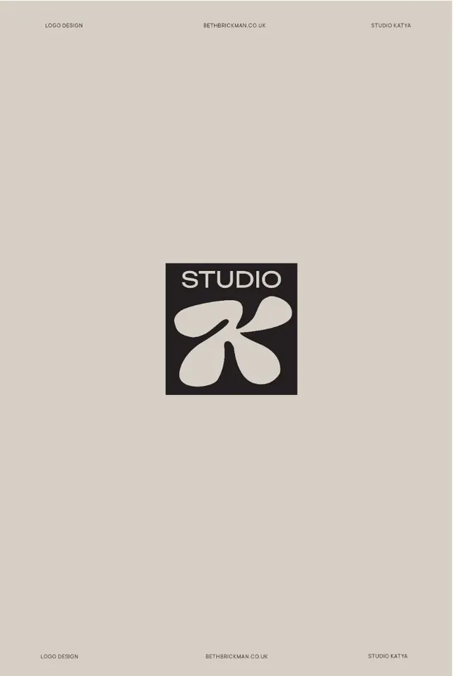
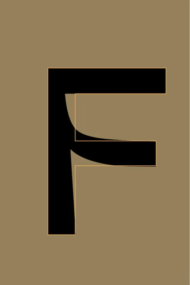
Geometric mark constructed from solid black rectangles with curved apertures outlined in warm gold, set on a taupe background.
Summary
Geometric mark constructed from solid black rectangles with curved apertures outlined in warm gold, set on a taupe background.
Visual description
A modular letter mark made of three stacked rectangular forms in solid black, each containing a large curved cutout (one convex, two concave) that reveals the taupe background and is rimmed with a thin gold stroke. The proportions are balanced vertically, with the curved apertures creating rhythm and visual interest while maintaining strict geometric structure. The mark reads as a single letterform (likely E or F) but functions as an abstract graphic symbol. The warm gold outline against the black and earthy tan palette creates sophisticated contrast and suggests luxury and refinement.
Key takeaway
The use of curved negative space within rigid geometry to add sophistication without complexity; the thin gold trim as a tonal accent that elevates the mark without additional color; and the restraint of using just three colors (black, gold, taupe) to convey premium positioning while remaining highly distinctive and memorable.
Reuse notes
Strong approach for luxury, finance, real-estate, or heritage brands seeking elevated, constructed identity marks. The brutalist geometric structure reads as timeless and authoritative. Gold accent works particularly well with dark backgrounds. Avoid applying this technique where warmth and approachability are primary brand values. Pairs well with serif or high-contrast sans-serif typography.