Preview image. Unlock full-res
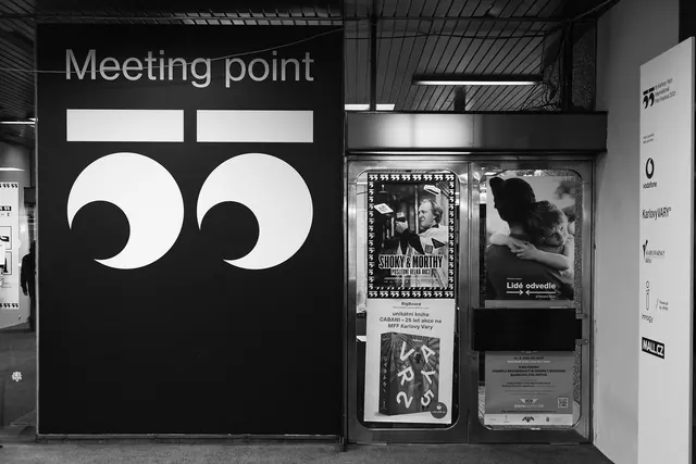
Black-and-white photograph of a festival meeting point where an oversized white 55 built from comma-like counters fills a black wall beside a poster-covered doorway.
More like this
See all
Summary
A festival wayfinding wall photographed in black and white, where the edition number is blown up into a wall-sized graphic built from two identical curved forms.
Visual description
The left two thirds of the frame is a matte black panel carrying the word "Meeting point" in light-weight lowercase sans-serif at the top, then an enormous white "55" below it. Each numeral is drawn as a flat horizontal bar over a large circular counter with a crescent bite taken out of it, so the pair reads simultaneously as digits and as oversized quotation marks. To the right of the panel, a metal-framed glass doorway is papered with film posters and event notices, including a heavily bordered film poster with a portrait, a photographic poster of two people embracing, and a book announcement with a colourful cover. A narrow white totem stands at the far right edge, topped by a small version of the same numeral mark with the festival name and year set beneath it, followed by a stacked column of partner logos separated by generous white space. Ceiling ducting and structural beams are visible above, and the whole scene is greyscale with deep blacks and a bright white poster field.
Key takeaway
The edition number is treated as the primary graphic rather than a caption, scaled until it becomes architecture. Because the numeral is drawn from a single reusable curved counter, the mark works identically at wall scale and at the tiny size on the totem header. Rendering everything in pure black and white lets the colourful posters sit next to the identity without competing with it.
Reuse notes
Reach for this when an annual event needs its edition number to carry the identity, or when signage must survive alongside dense third-party poster clutter. The approach depends on a mark abstract enough to still read as a number; a more conventional numeral set this large would look like a countdown rather than a logo. The strict greyscale is doing real work here, so introducing brand colour would break the contract that lets the posters be loud.
More like this



Keep what you find
A free account saves references to boards and can send you a weekly email of picks based on what you save.
To see every result, go Pro.