Preview image. Unlock full-res
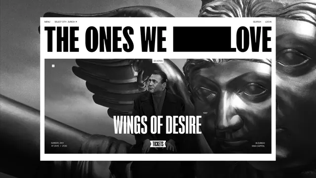
Black and white cinema platform homepage where a redaction bar sits inside the oversized wordmark and a film still fills both the card and the page behind it.
More like this
See all
Summary
A homepage for an on-demand cinema platform, rendered entirely in black and white, where the brand name carries a solid black bar through its own middle and the featured film still runs both inside the content card and enlarged behind the whole page.
Visual description
A grainy black and white film still of a winged statue and a man in a dark coat fills the browser edge to edge. A white sheet is inset over it with generous margins. Along the top of that sheet a thin utility row reads MENU and SELECT CITY: ZURICH with a small close cross on the left, SEARCH and LOG IN on the right, all in small letterspaced caps. Below it the wordmark runs the full width in very heavy condensed caps: THE ONES WE, then a solid black rectangle that swallows a word, then LOVE, so the bar reads as part of the lockup rather than as damage. Under the wordmark a second, smaller crop of the same still sits as a rectangular card. A tiny white chip labelled 33 VOTES straddles its top edge and a small info square sits in the upper left corner. The film title WINGS OF DESIRE is set across the lower middle of the card in white condensed caps, with 1987 in small type to its right. The card corners carry the screening details: SUNDAY, 24.11 AT 20:15 and 21:30 bottom left, IN ZURICH KINO CAPITOL bottom right, and a small white ticket-shaped TICKETS button centred on the bottom edge.
Key takeaway
The black bar set into the wordmark turns a censorship mark into a brand device, and it reads as intentional because it aligns exactly to the cap height. Running the same still twice, once cropped in the card and once blown up behind the sheet, builds depth without a second image or any color.
Reuse notes
Good reference for a ticketing, screening or event platform that wants to feel like film-poster print rather than a SaaS product. The vote count as a small chip on the card edge is a light way to surface community input. The whole system depends on strong monochrome photography, so it collapses if the imagery is weak or if brand color has to be introduced later.
More like this


Keep what you find
A free account saves references to boards and can send you a weekly email of picks based on what you save.
To see every result, go Pro.