Preview image. Unlock full-res
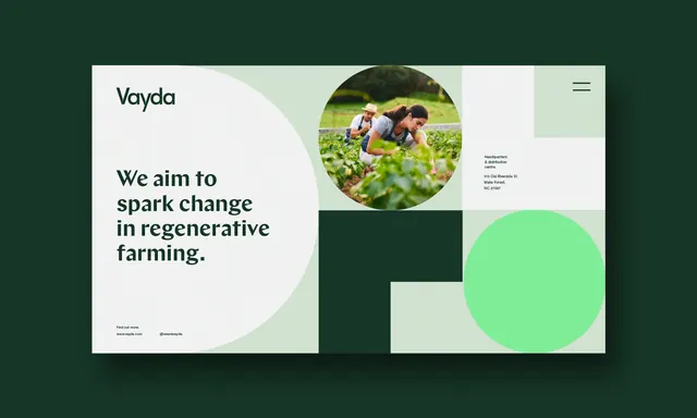
Vayda brand uses soft geometric circles and mint/dark green to convey environmental regeneration in farming.
Summary
Vayda's brand identity uses soft overlapping circles and a restricted palette of mint green and dark green to establish a system flexible enough for photography, mission copy, and modular layout.
Visual description
Two-card layout on dark green background. Left card: cream background with the Vayda logotype (simple serif, all-caps) above the headline "We aim to spark change in regenerative farming" in bold sans-serif. A large soft circle floats behind the headline. Right card: dark green background with a circular photograph of farmers in a field, a mint-green circle underlying one section, and a smaller mint rectangle. Minimal spacing, generous negative space, and soft circular forms dominate the system. The palette restricts to dark forest green, mint, cream, and off-white.
Key takeaway
The overlapping soft circles function as both ornamental shape and spatial organizer. The restricted color palette (two greens, neutrals) signals environmental purpose without relying on leaf or water imagery. Photography lives inside the geometric framework rather than as background.
Reuse notes
Strong for mission-driven or agricultural brands. Works in corporate to consumer contexts where stakeholder trust matters. The circle motif is minimal enough to work at large scale or in small applications like favicons.