Preview image. Unlock full-res
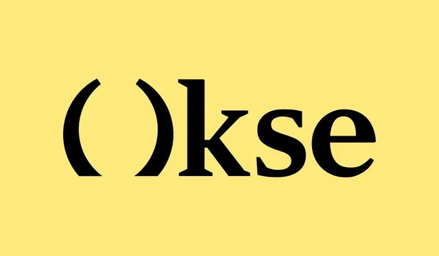
Bold black geometric sans-serif wordmark 'OKSE' centered on a warm mustard-yellow background, emphasizing stark contrast and architectural clarity.
Summary
A bold black geometric sans-serif wordmark "OKSE" positioned centrally on a warm mustard-yellow background, creating maximum contrast and architectural presence.
Visual description
The word "OKSE" appears in a heavy, geometric sans-serif typeface with consistent stroke weight and squared-off proportions. The letterforms are constructed from clean, architectural lines with minimal flourish, and the letters sit centered on a warm, saturated mustard-yellow background. The typography occupies roughly the middle third of the frame vertically, leaving substantial negative space above and below. The effect is stark, authoritative, and timeless, relying entirely on the contrast between the black characters and yellow field.
Key takeaway
The confidence of a single, enormous typographic statement without secondary elements. The warm background color choice, which feels less corporate than the expected white or gray and adds warmth without sacrificing legibility. The heavily geometric letterforms themselves, built from clear strokes that feel engineered rather than hand-drawn.
Reuse notes
Strong for architecture, engineering, and B2B brands that need an authoritative, unfussy visual identity. The yellow background works best in contexts where the color can be carried through supporting materials (stationery, signage, digital interfaces). Not recommended for heavy-use contexts where the high contrast might fatigue; best suited to focal marks and primary brand expressions.
More like this






Keep what you find
A free account saves references to boards and can send you a weekly email of picks based on what you save.
To see every result, go Pro.