Preview image. Unlock full-res
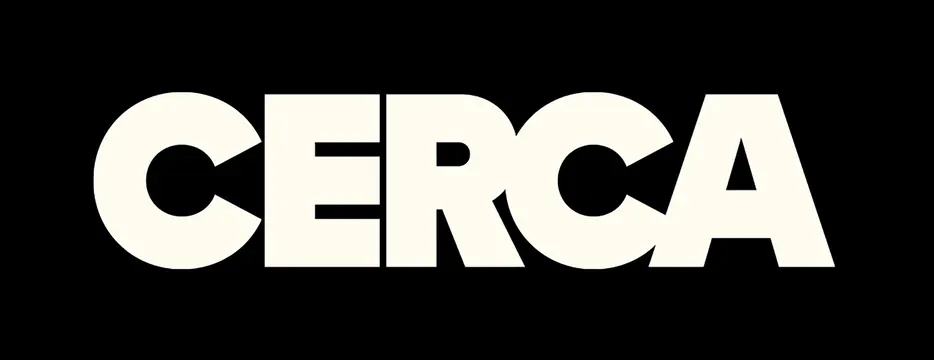
Bold uppercase logotype spelling CERCA in a heavy geometric sans-serif, with negative space cut through the first and third letters to create visual movement and brand distinction.
Summary
Bold uppercase logotype spelling CERCA in a heavy geometric sans-serif with negative space cut through the C and R, creating internal voids that add sophistication and break the monolithic form.
Visual description
Five-letter wordmark centered on a pure black background. The letters C-E-R-C-A are rendered in an extremely heavy, geometric sans-serif with uniform stroke weight and clean, right angles. The first C and third R each have a circular or geometric negative void cut through the letterform (the C's void is a clean circle; the R's void is a triangular or wedge shape). The letters are tightly tracked with consistent spacing. The overall white-on-black contrast is absolute, with no intermediate greys or softness.
Key takeaway
The use of controlled negative space within individual letters to signal intentionality and avoid heaviness. The geometric sans-serif with cut-outs is more memorable and distinctive than the wordmark alone. The absolute figure-ground relationship (pure black, pure white) reads as authoritative and timeless.
Reuse notes
Ideal for corporate identities in consulting, technology, or B2B services. The geometric abstraction suggests innovation and precision. The high-contrast black-and-white treatment works equally well at large scale (signage) and small scale (favicon). Pair with contemporary sans-serifs for supporting typography to maintain the geometric language.
More like this



Keep what you find
A free account saves references to boards and can send you a weekly email of picks based on what you save.
To see every result, go Pro.