Preview image. Unlock full-res
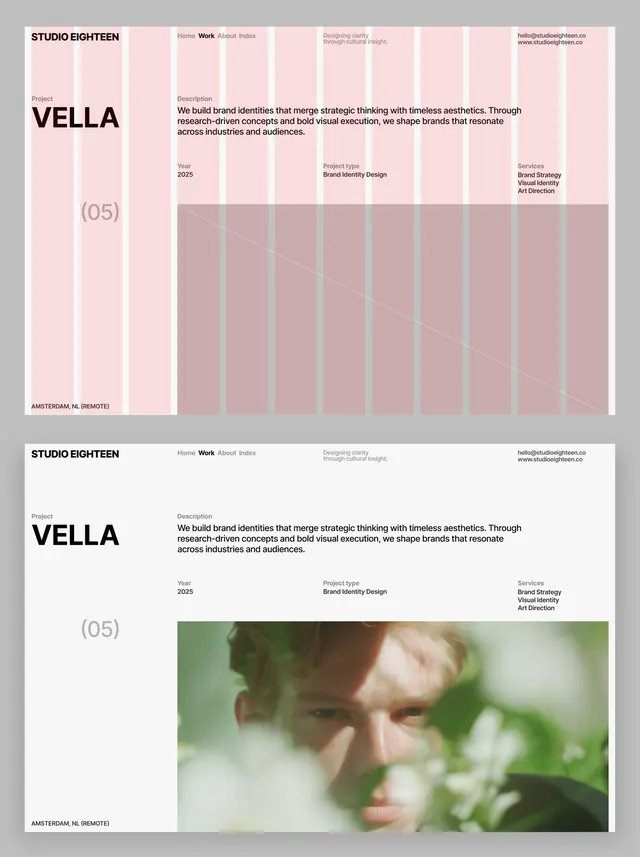
VELLA brand identity system showing dual-layout approach with pastel color grid abstraction and photographic application across grid structure.
Summary
Studio Eighteen's VELLA identity demonstrates two applications of a refined grid-based system: one with abstracted color fields and another pairing the grid with photography.
Visual description
Two-part layout presentation. Top: VELLA project identity on left (bold sans-serif wordmark with "(05)" in lighter weight, labeled "Amsterdam NL Demode") alongside grid of soft pastel color blocks in pink, beige, and muted mauve with a diagonal line overlay, suggesting color and layout specifications. Bottom: same VELLA identity and grid structure paired with a full-width portrait photograph of a figure in soft focus among greenery, showing how the grid system accommodates imagery. Consistent sans-serif hierarchy throughout; generous whitespace and clear information zones separate typographic and visual content.
Key takeaway
The modular grid pattern as a living design system element, not just layout tool; it becomes a visual signature that bridges abstract color language and photography. The pastel palette reads refined without becoming precious; warm neutrals anchor cool pinks. The two-layout approach documents both systematic thinking and real-world application.
Reuse notes
Excellent model for design studios, creative agencies, and contemporary brands balancing modern sophistication with warmth. The grid structure accommodates both abstract design thinking and photographic content, making it adaptable across various media. Soft pastel palette reads well in digital and print; the beige/pink combination suits premium, contemporary positioning.
More like this







Keep what you find
A free account saves references to boards and can send you a weekly email of picks based on what you save.
To see every result, go Pro.