Preview image. Unlock full-res
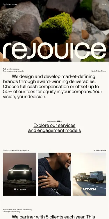
Creative agency website featuring a nature-inspired hero of moss-covered stones, followed by centered service copy and a three-column grid of project case studies.
Summary
A sophisticated agency homepage anchored by a full-width nature photograph (moss-covered rocks), introducing the brand's service philosophy in centered sans-serif text, and closing with a three-column grid of project case studies.
Visual description
The layout is single-column, stacked in three distinct zones. The hero spans full width at top: a close-up photograph of textured moss-covered stones in natural grays, greens, and warm browns. Below, a centered content block holds the brand name "rejouice" in a clean sans-serif, followed by 2-3 sentences describing their service offerings in smaller, warm-gray text with generous leading. A horizontal divider provides breathing room. The final section presents a 3x1 or 3x2 grid of client case study images (photographs and design mockups in the same naturalistic, muted palette). The entire composition rests on an off-white background. Typography uses a geometric, contemporary sans-serif throughout in black, warm gray, and pale taupe. The color palette merges the stone photograph into a cohesive system: off-white, charcoal, muted olive, warm brown, and stone gray.
Key takeaway
The hero-as-foundation move establishes the brand's values without text. Centering the service copy on a simple background (not inside a card or box) creates a luxury feel through restraint. The case-study grid at the close proves capability without overselling. The palette bridges the organic nature photograph into the typography and layout, making every choice feel deliberate.
Reuse notes
Effective for service-driven creative agencies, especially consulting or design studios. The centered layout limits horizontal scanning, making it slower and more considered; best at desktop scale where breathing room is abundant. Works for projects-first positioning; less suitable for feature-heavy or comparison-driven messaging. The nature imagery is authentic rather than decorative, suiting brands aligned with sustainability or craft.
More like this





Keep what you find
A free account saves references to boards and can send you a weekly email of picks based on what you save.
To see every result, go Pro.