Preview image. Unlock full-res
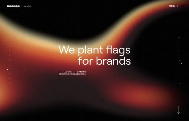
Hero landing page for Monopo design studio featuring flowing radial gradient from burnt orange to black with centered white typography.
Summary
Landing page hero for Monopo (London design studio) with organic radial gradient flowing from warm burnt orange into deep black, anchoring white headline text and tagline.
Visual description
A full-screen dark hero dominated by a large organic radial gradient that sweeps from burnt orange and warm brown tones in the center-left to deep black at edges and corners. The gradient is soft and fluid, with subtle speckled texture giving it an atmospheric quality. Centered white sans-serif typography reads "We plant flags for brands" with smaller sub-text below listing "brands, campaigns and digital." The Monopo logo and "London" appear in the top-left corner, and a faint navigation menu sits in the top-right. A subtle downward arrow indicator is visible at the bottom-right, suggesting scrollable content.
Key takeaway
The organic radial gradient as a mood anchor: by concentrating warm earth tones in the center and fading to black, the composition creates depth and atmosphere without requiring illustration or photography. The technique works equally well on light or dark backgrounds.
Reuse notes
Effective for agency/studio homepages where brand personality needs to feel artistic and sophisticated without literal imagery. The gradient-as-background pattern scales from mobile to large desktop screens and remains readable with any centered text overlay.
More like this



Keep what you find
A free account saves references to boards and can send you a weekly email of picks based on what you save.
To see every result, go Pro.