Preview image. Unlock full-res
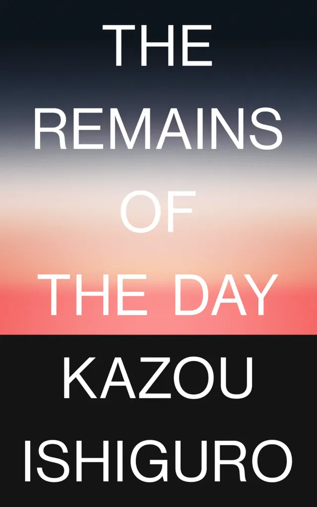
Minimalist book cover with stacked sans-serif typography layered over a soft vertical gradient from charcoal through peachy salmon to dark navy blue.
Summary
Minimalist book cover using stacked typography over a soft, full-height gradient transitioning from dark charcoal at top through warm salmon in the middle to deep navy at the bottom.
Visual description
Centered, vertically-stacked composition. The title "THE REMAINS OF THE DAY" appears in four lines of white sans-serif capitals of varying sizes, with "THE" and "OF" smaller and rendered in thinner weight, while "THE DAY" receives emphasis through slightly larger scale. Below, the author name "KAZOU ISHIGURO" anchors the bottom in a narrower, uppercase sans-serif. The background is a clean vertical gradient: charcoal gray at top, transitioning through warm peachy-salmon in the middle bands, then deepening to dark blue-black at bottom. All typography sits in high contrast against this gradient field, with ample breathing room above and below the text.
Key takeaway
The gradient itself does the work here, creating mood and directing the eye through the composition without graphic elements. The typographic hierarchy through size and weight variation keeps a single typeface family feeling dynamic. The warm center band framing the wordbreak is an elegant guide that feels intentional without being obvious.
Reuse notes
Use as a book cover template for literary or editorial work. The soft gradient is particularly effective for introspective or melancholic messaging. Works well when the text itself carries the narrative and no imagery is needed. Responsive to content: shorter titles or names might look isolated in the center; taller stacks feel more anchored. Most successful when gradient colors reinforce the mood (warm/cool/dark palettes work best).
More like this









Keep what you find
A free account saves references to boards and can send you a weekly email of picks based on what you save.
To see every result, go Pro.