Preview image. Unlock full-res
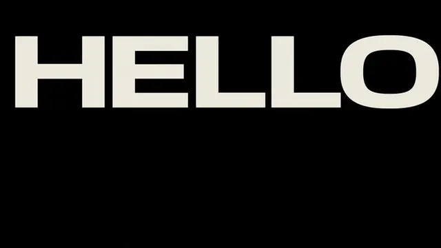
Horizontal word mark 'HELLO' in bold, chunky geometric sans-serif letters with uniform stroke weight, white on black.
Summary
White word mark 'HELLO' rendered in a bold, geometric sans-serif with uniform, chunky letterforms centered against a jet-black ground.
Visual description
The word 'HELLO' is set in a geometric sans-serif typeface with consistent stroke weight throughout. Each letterform is robust and angular, occupying horizontal space with generous proportion. The O characters employ rounded geometry while maintaining the typeface's overall blocky character. White text sits centered and fills the frame width against a pure black background, creating stark contrast with no secondary elements.
Key takeaway
The typeface's uncompromising weight and geometric purity: this logotype works at any scale because of its uniform stroke weight and minimal negative space complexity. The high contrast and single-color deployment makes it infinitely adaptable across applications.
Reuse notes
Strong choice for bold, approachable brands in tech or consumer goods where confidence matters. The horizontal orientation fits navbar headers or hero lockups. Avoid contexts requiring footnote or secondary text placement, as the scale leaves little room for supporting information.