Preview image. Unlock full-res
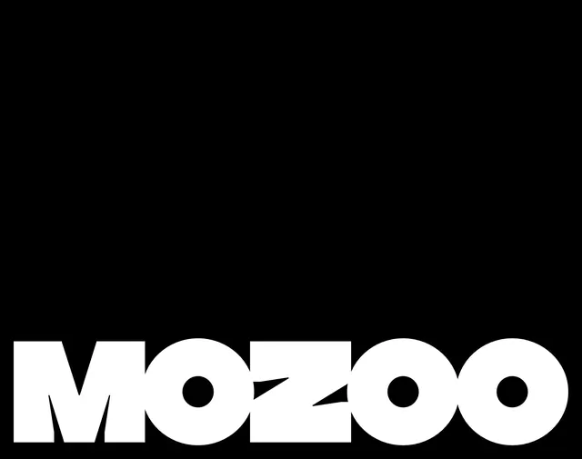
Heavy geometric wordmark where circles are subtracted from each letter, creating a distinctive negative-space treatment within a bold sans-serif.
Summary
Large-cap wordmark "MOOZOO" set in a heavy geometric sans-serif where solid circular voids are subtracted from select letters, creating a playful yet sophisticated mark on black.
Visual description
All-caps wordmark occupying the lower third of frame in pure white against black background. Each letterform is constructed from thick, geometric strokes with consistent stroke weight. Solid black circles (or rounded rectangular voids) are cleanly subtracted from the O's and one other letter, creating punchy negative space accents. The letters maintain their readability despite the cutouts. Monochromatic, high-contrast, horizontally centered composition with balanced letter spacing.
Key takeaway
The circle-subtraction technique is a playful variation on negative-space design that breaks the pure geometric minimalism with a touch of whimsy. This approach works especially well for brands in entertainment, lifestyle, or child-oriented spaces where a hint of personality is desired without abandoning geometric discipline. The technique is scalable and scannable at small sizes.
Reuse notes
Ideal for consumer-facing brands (apps, entertainment, lifestyle) seeking a contemporary yet accessible voice. The playfulness signals approachability while the heavy weight and geometry convey confidence. Works equally well on dark and light backgrounds when reversed.