Preview image. Unlock full-res
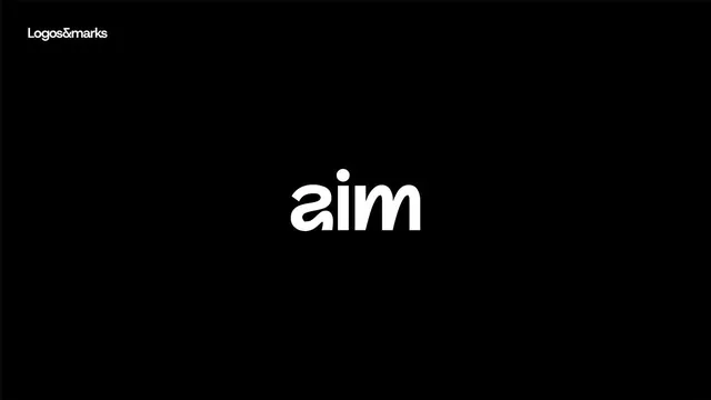
Lowercase wordmark 'aim' in clean sans-serif anchored by a simple dot above the letterforms, centered on a black ground with white typography.
Summary
A stark logotype reading 'aim' in lowercase sans-serif with a dot punctuation mark, displayed in white on solid black with geometric restraint and maximum whitespace.
Visual description
The composition is radically minimal: a single centered element combining lowercase letters 'aim' in a modern, geometric sans-serif with a simple dot positioned above. Both letterform and dot are rendered in bright white. They float against an expansive black background that dominates the frame. A secondary line of text in small white type reads "logos&marks" in the upper left corner. The visual effect is one of extreme clarity and focus, the white forms reading almost as geometric shapes against the void.
Key takeaway
The restraint is the move: letting negative space do the heavy lifting and using punctuation as a secondary mark. The lowercase treatment feels contemporary and approachable. The high contrast ensures legibility and impact at any scale.
Reuse notes
Strong foundation for tech, consulting, or data-focused brands needing authority without ornamentation. The dot can serve as a repeatable secondary element (favicon, button, divider). Black-and-white treatment ensures versatility. Avoid using on pale backgrounds only; contrast is essential to the concept.
More like this





Keep what you find
A free account saves references to boards and can send you a weekly email of picks based on what you save.
To see every result, go Pro.