Preview image. Unlock full-res
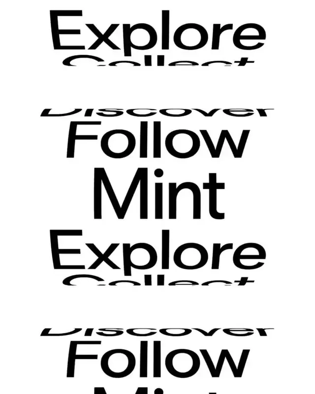
A stacked-text composition alternating between Explore and Discover (in large sans-serif) with Follow and Mint in between, forming a dense vertical logotype or mark.
Summary
A bold, stacked-text logotype alternating Explore, Discover, Follow, and Mint in large, heavy sans-serif type, creating a compact vertical wordmark with repeating pattern.
Visual description
Five lines of text stacked vertically in heavy black sans-serif (likely a bold weight of a modern font). Alternating words cycle through "Explore" (large), "Discover" (smaller, beneath a strikethrough), "Follow" (large), and "Mint" (large), then repeat. The composition is centered on a white background, with the heaviness and size relationships creating a strong visual rhythm. No graphics, decorations, or additional elements interrupt the typographic focus. The type is perfectly black with no variation, producing stark monochrome contrast.
Key takeaway
Repeating a short word sequence vertically creates memorable, pattern-like logotypes. The stacking approach creates a compact footprint suited to small applications. Heavy sans-serif at this scale is bold and commanding without needing color.
Reuse notes
Suits brands with short, punchy names or value statements. Use this pattern for words that benefit from repetition or declaration. Works well at both large (header) and small (favicon/stamp) scales due to the bold weight and clear letterforms. Consider kerning carefully when adapting to avoid awkward word breaks.