Preview image. Unlock full-res
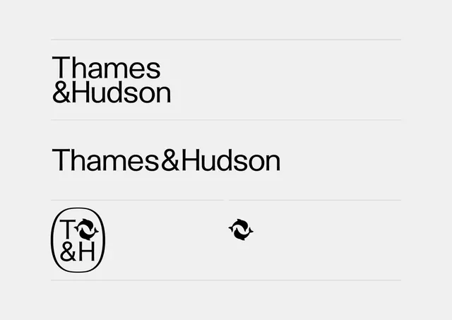
Clean monochrome brand presentation: stacked wordmark with custom ampersand, lockup variant, and oval-badged emblem built from stylized letterforms.
Summary
Typography-first brand identity for a publishing house: wordmark stacked across two lines, a modern serif ampersand, full lockup, and compact emblem rendered as a circle with letterform geometry.
Visual description
Light gray background with black typography. Top section shows "Thames & Hudson" stacked on two lines in a large, clean sans-serif (narrow character width, high x-height). A thick horizontal line sits above the text. Middle section presents "Thames&Hudson" as a continuous line in the same sans-serif, suggesting a secondary lockup. Below, a circular badge contains "T & H" stacked vertically, with a custom symbol to the right: curved shapes suggesting movement or a visual mark built from abstract letterform geometry. All elements use pure black and white, high contrast, minimal ornamentation.
Key takeaway
The discipline of using a single sans-serif family across wordmark, lockup, and symbol, varying only in arrangement and scale. The emblem-inside-circle convention for badge/signature use. The stacked wordmark treating the ampersand as a design hero. Clean horizontal rules framing the text for breathing room and emphasis.
Reuse notes
A textbook approach for heritage publishing, literary, and established-brand contexts where tradition and legibility matter equally. The badge works well for stationery, covers, and digital favicons. The full wordmark needs space; pairs best with generous margins and editorial layouts.
More like this








Keep what you find
A free account saves references to boards and can send you a weekly email of picks based on what you save.
To see every result, go Pro.