Preview image. Unlock full-res
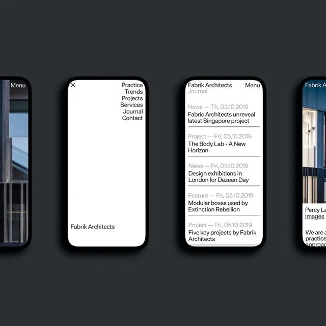
Fabrik Architects' mobile site shows a stacked card layout with minimal dark interface, pairing large sans-serif headlines and navigation links in white type against charcoal backgrounds.
Summary
Fabrik Architects' mobile site shows a stacked card layout with minimal dark interface, pairing large sans-serif headlines and navigation links in white type against charcoal backgrounds.
Visual description
Three vertical mobile screens, dark charcoal background, each card rounded at corners and framed in white border. Left card: menu link and "Fabrik Architects" wordmark in white sans-serif on dark ground. Center card: headline "Fabrik Architects" (all-caps, display weight) at top, then dense list of dated project entries below (white type, smaller sans-serif, all-caps labels like "Journal", "Fri, 05.10.2019" paired with project titles). Right card: partial view of another project screen. Minimal visual hierarchy achieved through type weight and size, no icons or images. Left margin shows glimpse of navigation, rightmost glimpse shows "Fabrik Arch" wordmark.
Key takeaway
The card-based mobile layout for portfolio or project browsing, using type weight alone to establish hierarchy. The stacked all-caps labels with dates create structured metadata without elaborate design. The rounded-corner card boundaries create visual separation and air on a dark ground. The consistent sans-serif system across headlines, body, and metadata for unified editorial identity.
Reuse notes
Strong foundation for architectural or design portfolio websites. The dark background reduces visual fatigue on mobile devices while projecting professional seriousness. Effective for project timelines or dated content (exhibitions, releases). The stacked-card structure translates well to blog archives or case-study collections. All-caps labels work best when the vocabulary is consistent (always date-format, always category, always location).
More like this

Keep what you find
A free account saves references to boards and can send you a weekly email of picks based on what you save.
To see every result, go Pro.