Preview image. Unlock full-res
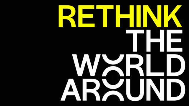
Bold sans-serif wordmark split across three lines in high-contrast yellow and white on a solid black ground, designed for maximum visual impact.
Summary
Bold sans-serif wordmark split across three lines in high-contrast yellow and white on a solid black ground, designed for maximum visual impact.
Visual description
The composition uses pure black as the field, with large geometric sans-serif letters spanning three stacked lines. "RETHINK" appears in luminous yellow in the top line, while "THE WORLD AROUND" follows below in white, creating a stark colour hierarchy. The typeface is condensed, uppercase, and geometric with clean, sharp terminals. Generous letterspacing and precise vertical alignment amplify the directness of the message. No imagery, pattern, or ornament; the type itself is the sole design element.
Key takeaway
The extreme simplicity of stacking and colour differentiation to create hierarchy without layout complexity. The pairing of a single accent hue against neutral darks and lights for instant readability and menace. The technique of using all-caps + geometric sans-serif + ample spacing to convey urgency in advertising and branding contexts.
Reuse notes
Ideal for posters, advertising, manifestos, or brand statements that demand attention. Works best on large formats where the geometric precision and letterspacing read clearly. The yellow-on-black contrast is particularly effective for campaign advertising and editorial covers; pair with institutional or technical typefaces. Avoid on small screens where tightness may collapse the impact.
More like this



Keep what you find
A free account saves references to boards and can send you a weekly email of picks based on what you save.
To see every result, go Pro.