Preview image. Unlock full-res
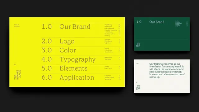
Brand guideline spread pairing a neon-yellow left panel with centered table of contents against a dark teal and white right panel with introductory copy.
Summary
Brand guideline spread pairing a neon-yellow left panel with centered table of contents against a dark teal and white right panel with introductory copy.
Visual description
Left panel: vibrant neon-yellow background, nearly full-bleed, anchored by a sans-serif contents table in olive-yellow type reading 1.0 through 6.0 (Our Brand, Logo, Color, Typography, Elements, Application), with page numbers. Rotated sans-serif all-caps 'The Humans Are' text reads vertically along the left edge, also in olive tone. Right side split: upper dark teal card with 'Our Brand' and icon/text elements, lower white card with a serif 'foundational' label and body copy in gray type stating 'Our framework serves as our foundation...' Dark background surrounds both panels, suggesting a presentation or book spread. Sharp edges, strong geometric division, high contrast between yellow-to-teal-to-white zones.
Key takeaway
High-contrast color blocking as a navigation and visual system. The neon yellow creates immediate visual hierarchy and draws attention to structure (the contents table) without competing with information. The secondary teal-and-white panels establish a calm counterpoint, breaking up the energy. All-caps reversed type reads as authoritative. Numbered hierarchy (1.0, 2.0) suggests a systematic, comprehensive identity system. Type contrast (sans-serif heads, serif body) signals shift between informational and narrative sections.
Reuse notes
Perfect template for brand guidelines, business reports, and corporate presentations needing bold energy with structured hierarchy. Yellow and teal pair reads as premium and modern, especially with the dark background. Scale the neon intensity down for less aggressive applications. The layout assumes a print or PDF context but concepts translate to web (modular card system). Works best when the client wants memorable, energetic branding presentation.
More like this

Keep what you find
A free account saves references to boards and can send you a weekly email of picks based on what you save.
To see every result, go Pro.