Preview image. Unlock full-res
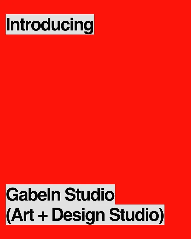
High-contrast presentation opening with signal-red field and bold black sans-serif labeling the studio name and craft.
Summary
A presentation cover for Gabeln Studio using a signal-red full-bleed background with stacked black sans-serif type introducing the studio name and tagline "Art + Design Studio" at the top and bottom.
Visual description
A full-screen (or poster-sized) composition filled with vibrant signal-red. Near the top, a white rounded rectangle contains the word "Introducing" in bold black sans-serif, left-aligned. Centered vertically is negative space. At the bottom, a white band holds "Gabeln Studio" on the first line and "(Art + Design Studio)" on the second, again in solid black sans-serif, structured in a stacked left-aligned layout. The intense red draws immediate attention and creates urgency; the black-on-white text labels pop against it and are highly legible.
Key takeaway
The red as a pure communication tool, not decoration. The restraint of using only red, white, and black creates maximum impact. The stacked text arrangement at top and bottom anchors the composition without cluttering the center, leaving breathing room.
Reuse notes
Strong for pitch decks, studio portfolios, or announcement presentations. Works especially well as a title slide or intermission break between sections. The urgency of the color suits product launches or calls-to-action; pair with more neutral slides to avoid fatigue. Less suitable for long-form content; use sparingly.