Preview image. Unlock full-res
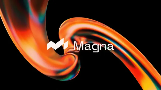
Abstract logotype pairing a flowing organic mark in pink/purple/orange gradient with clean geometric sans-serif type, set against black.
Summary
Abstract logotype pairing a flowing organic mark in pink/purple/orange gradient with clean geometric sans-serif type, set against black.
Visual description
A large abstract mark sits to the left of the wordmark. The mark is composed of smooth, overlapping curved strokes in a continuous gradient: beginning warm pink at the top-left, shifting to coral-orange in the middle, then to purple and teal toward the bottom-right. The strokes are organic and hand-drawn-feeling, creating a sense of fluid motion. White sans-serif type reading "manifold" sits to the right in a tight monospace-like weight, evenly spaced. A small circular icon appears above, in similar blue. The entire composition sits on black, creating stark contrast and drawing all attention to the mark and text.
Key takeaway
The gradient striping within a single organic form reads as both playful and sophisticated, suggesting motion without literal arrows. Pairing loose, fluid geometry with rigid type hierarchy creates visual balance and brand personality. The black background amplifies the mark's glow and makes the color pop.
Reuse notes
Strong fit for tech, creative, and developer-tool brands seeking to appear innovative yet trustworthy. The organic/geometric split signals both accessibility and technical credibility. Gradient works at scale and in single-color contexts (can be simplified to a solid hue). Best paired with brands targeting design-forward audiences; may read as trendy to more conservative verticals.