Preview image. Unlock full-res
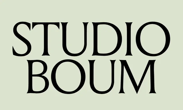
A minimalist all-caps wordmark in large, high-contrast black sans-serif with generous letter spacing on a light beige background.
Summary
A minimalist wordmark displaying "STUDIO BOUM" in large black all-caps sans-serif with wide letter spacing against a light beige ground.
Visual description
The text "STUDIO BOUM" is rendered in two lines using a geometric, high-contrast sans-serif typeface with generous letter spacing. All characters are uppercase. The letterforms are substantial and bold, with even stroke weight and clean, vertical proportions. The text sits centered on a soft beige background, creating maximum contrast without hard edges or color accents. The spacing between letters is wider than typical, emphasizing each character as an individual form. The overall composition is centered and symmetrical, with ample negative space surrounding the type on all sides.
Key takeaway
The power of generous letter spacing to elevate a simple typeface into a sophisticated logo. The use of neutral, high-contrast colors (black on light beige) that work across media without requiring color reproduction. The vertical stacking of two words in all-caps to create a square-ish, balanced silhouette suitable for multiple applications.
Reuse notes
Ideal for design studios, creative agencies, and luxury brands where understatement conveys confidence. The wide spacing and geometric sans-serif suit contemporary, minimal identities and work well at small scales (social avatars) and large scales (signage). Pair with single-color applications and limit to professional, gallery, or editorial contexts where the aesthetic feels appropriate. The all-caps treatment with spacing can be applied to other two-word names; test letter spacing at each scale.
More like this





Keep what you find
A free account saves references to boards and can send you a weekly email of picks based on what you save.
To see every result, go Pro.