Preview image. Unlock full-res
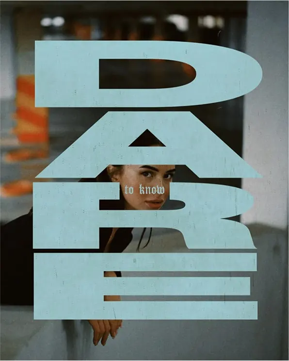
Editorial typography treatment using large display letters as window cutouts, where a human figure visible through the negative space becomes part of the typographic composition.
Summary
A type specimen using oversized sans-serif letters as window cutouts, where a figure glimpsed through the letterforms becomes an integral part of the typographic composition.
Visual description
The word "DARE" is set in an enormous, blocky display sans-serif, cut out as holes revealing a figure standing behind the type. The pale blue-gray letterforms frame the person's torso, shoulders, and face, creating a dynamic interplay between text and figure. The composition is spare and centered, with ample negative space (white background), allowing the figure's skin tone and clothing to provide the only additional color accent beyond the cool letterforms.
Key takeaway
Using figures or photography as a compositional element within or behind typography bridges graphic design and portraiture. The technique works because the letters remain legible while the human presence adds narrative and warmth. The oversized display scale and high contrast keep the type readable despite the competing visual interest.
Reuse notes
Effective for branding or editorial work seeking to humanize abstract concepts or add personality to minimal type. The technique works best when the figure is recognizable and positioned intentionally within the letterforms. Pairs well with cool, muted color palettes and sans-serif families with generous proportions.
More like this






Keep what you find
A free account saves references to boards and can send you a weekly email of picks based on what you save.
To see every result, go Pro.