Preview image. Unlock full-res
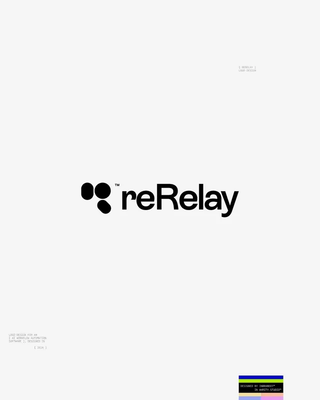
A minimal geometric logo for reRelay combining three overlapping circular dots with a clean sans-serif wordmark on a light gray background.
Summary
A mark for reRelay (an AI workflow-automation software) featuring three interconnected black circles with a proportional sans-serif wordmark, positioned centrally on pale gray with design credits and color palette strip below.
Visual description
The design is centered vertically on a light gray background. The mark itself consists of three filled black circles arranged in a triangular cluster (two circles in the upper tier, one below center-left, overlapping slightly), each the same diameter. The sans-serif wordmark "reRelay" in bold black sits immediately to the right of the mark, using a geometric sans with tight letter spacing, the "re" prefix smaller and the "Relay" portion emphasized. A small trademark symbol appears above the "e". Text in minimal gray caps appears in the upper right ("[ BERELAY ] / LOGO DESIGN"), and footnote text in very light gray bottom-left reads "LOGO DESIGN FOR AN / AI AUTOMATION AUTOMATION / SOFTWARE. DESIGNED IN / [ 2026 ]". The footer shows a color palette strip with four swatches: navy blue, black, pastel pink, and pale blue. The overall effect is restrained, gridded, and intentionally documentary (showing the designer's hand and process).
Key takeaway
The three-circle mark is instantly recognizable and works across scales, from favicon to billboard. The relationship between mark and wordmark (touching without merging) allows them to be used separately or locked together. The intentional inclusion of design credits and a color palette makes this feel like a design system asset, not just a logo, which signals professionalism and thoughtfulness.
Reuse notes
Ideal for tech, SaaS, or developer-tool brands where connectivity and automation are central to the story. The neutral black-on-white rendering works everywhere (print, digital, app icon) without decoration. The mark's symmetry and simplicity mean it scales down to small sizes without losing readability. Best for audiences that appreciate design craft and minimalism. The three-dot motif has become somewhat common, so originality depends on execution and brand story rather than novelty.