Preview image. Unlock full-res
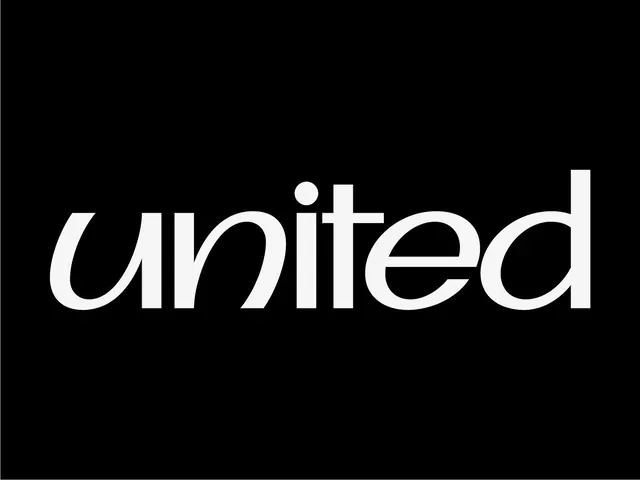
White geometric sans-serif wordmark on solid black, emphasizing stroke consistency and letterform clarity through austere negative space.
Summary
White wordmark on black featuring geometric sans-serif letterforms with a single centered dot accent above the second letter, projecting restraint and technical precision.
Visual description
Centered composition: wordmark "united" in all lowercase white sans-serif on full black field. The typeface has uniform stroke weight, minimal serifs, and clean geometric construction. The "i" dot is replaced with a small filled circle positioned slightly left-of-center above the stem, adding a subtle branding flourish. Letterforms are widely spaced, with ample breathing room between each character. The overall effect is stark and composed, relying entirely on type and negative space with zero visual ornament.
Key takeaway
The restraint of the centered dot accent—a single mark that differentiates without distracting. The type's stroke consistency creates legibility and memorability at any scale. The choice to go monochromatic frees the design from color trends.
Reuse notes
Strong choice for tech, finance, or B2B brands seeking sophistication without decoration. Works equally well at large (signage) or small (favicon) scales. Pair with spacious layouts and minimal supporting graphics to maintain its austere quality.